Sunday, 25 April 2010

Tuesday, 20 April 2010

Constructing My Contents Page [Final)

Here is my final contents page piece.
I was completely happy with this as it fitted my criteria and met all of my demands.
As i have mentioned I disliked my old picture and therefore used the same picture but did some major alterations to it.
This image was used to make the audience more engaged with the magazine and i feel that it has done the trick as many of my class mates have said it looked really good and drew them in as they had never seen an image edited like this before on a magazine contents page, This was good for me as it differentiated from other magazines out there and makes it stand out.
I placed my masthead 'TurntUP' on the top right hand corner to remind the readers of the magazine, and the more that they see my masthead the easier they will remember the magazine name and hopefully refer this to others.
I thought that the text that i used was very appealing as it had a cool reflecting text which i thought went really well. The colours used were also bright and colourful like the rest of my magazine. I liked this because it gave a consistent feel throughout and does not make readers feel like they reading a different magazine.
I decided that the actual contents features were just simply going to be written in that big empty space as there was room under the picture. I wanted all the context to be short yet catchy and also keep the reader wanting to get stuck into the magazine.
Overall I was really pleased and happy with the outcome.

Constructing My Contents Page [Draft)

Here is my first draft layout for my contents page.
In my opinion I really disliked the look of this Page. To me it had no reference to music and did not quite appeal to my target audience as i had hoped.
The picture as stated previously in my before/after post, it just did not fit my criteria as it looked completely off focus and just was not attracting enough.
The actual page numbering and contexts were also highly disliked due to the fact that they were boring. Even though I wanted my context to be simple and eye-cathing the layout and text on this page was just not giving me that feeling and if i wasn't immediately drawn to it then I thought that there was no way that my target audience who was presumably my age and older would definitely not be taken by it.
So to fix this problem Major alterations were needed to be put in to action.

Planning My Contents Page

Here is my rough sketch/plan/layout for my contents page.
I wanted to put an image of my artist/model on the top half of the page to make it appeal to my target audience, it also in some way makes my audience want to read my artist's 'exclusive interview' so I 'Promoted' her interview to get the readers engaged and intrigued.
Just like my other Magazine Pages I had to keep to the same house-style, therefore the colourful border was used to give it an bright,colourful,vibrant edge that would definitely appeal to my preferred Target Audience.
I planned to put the word 'Contents' at the top of my page and I also planned to make it multi-coloured so it has the same continuous colour theme throughout.

Saturday, 17 April 2010

My First Interview Page [Test 2)

This is my final Interview Page Layout.
I used the same design as my previous one. I kept the same consistent colour theme and same house-style.
I really liked the outcome of this page as I thought my previous interview page looked rushed and completely unconventional, and seemed like i didn't think it through therefore resulting in me just applying all of the contents everywhere and anywhere.
The background here is yet again black as the colour is part of my house-style and i feel that 'black' reflects my chosen colour pallet as it really goes well and complements all of the vibrant, loud, bright colours that i had chosen.
According to my rough layout sketch, everything went according to plan.
I had placed my main image on one side of the double page spread, and I had placed my interview's questions and answers on the left hand side, Each question went one after another in columns. The left side columns are adjusted in your typical left-to-right alignment, whereas on my right side columns I decide to differentiate and align the columns from right-to-left instead.
Pull quotes have also been used. I thought that the middle bit in between the two columns would have been empty and made the page look awkward, therefore I put two pull quotes in between to fill the space up and also make it look more like an music magazine interview page.

My First Interview Page [Test 1)


This is my first layout, final interview page. I really like the colour theme and the bright border around the page, however i feel that the picture was of a low quality and the actual interview layout was really rushed and therefore did not look like an complete magazine. So in order to make it look like a proper magazine page I edited the whole thing.

Writing Up my Interview

This was my final constructed interview in which I typed up onto a Word Document

How about you tell everyone a little bit about yourself, just in case they haven't heard of you."SUP! I'm Alisha, goofy, kind of weird, super out going, unique and last but not least Creatively Talented! I started from a dance [jerkin) YouTube teen sensation to a Hip-pop/RnB/techno music artist! I've been in multiple music videos, performed on 106&park, bet awards pre show, and many shows of my own! I'm starting my own clothing line, movement, and label so stay tuned! Also I'm doing a MTV show! Keep updated on me at www.twitter.com/alishaunchanined!!!”

Who is your biggest inspiration?"Hmmm, growing up I always liked Run DMC, Madonna, New Edition, Michael Jackson- lots of 80'z artists. But I've never truly had an inspiration. Its like, I've always been my own person. I pushed myself, and my dreams inspired me!”

Are there any other industry friends that you have met?"Hmmm many! I’ve Met Ciara, Chris Brown, Lil Wayne, New Boyz, Rihanna and Soo many more."

What can we expect from your album, "The Death of Vanity?"Well don't expect anything like my old music!! The death of "vanity" symbolizes the death of the old me! I'm still the same different "Alisha" but I have a bigger purpose now. I want to change lives with my music, not just make fun "conceited" music. Everyone can relate to music with a meaning, and I'm trying to win the hearts of the world, not only the UK. So expect a more fun pop feel, with real meaning."

If you could collaborate with one artist who would you choose and why?"Chris Brown! Love his music, I'm working on getting that poppin right now so stay tuned!”

What is the most important thing about you, that you feel people should know?"That I care about all my supporters well being!! If I can't be a good example to you, I've failed! I'm all about peace, good, and fun! That includes haters!”


Planning my interview

Unfortunately I wasn't able to interview an actual recording artist so therefore I had to result in interviewing my sister. I made her pretend to be an upcoming music artist and tried to get her to answer the questions as truthfully and realistically as possible.
The type of questions I asked her was like :
- Introduce Yourself , incase some people may not have heard of you
- Who's your inspiration?
- What can we expect from your latest upcoming album?
- Have you met any other artists in the music industry?

After I asked her a couple more questions and wrote down her answers I then proceeded to type out the interview on a word document.

Rough Layout of my Interview Page

This is my rough layout sketch for my interview page, I want to put my artists picture on one whole side of the double page spread and then have my actual interview questions and answers on the other page. I also planned to have a few pull quotes in the middle of the left page and another pull quote near the artist's image.

Noting My Conventions

................

Evaluating My Language Choices

.............

'Turnt UP' = My Magazine Name

After thoroughly going through my possible name choices I decided to go for 'Turnt UP'
The slang term 'Turnt UP' started in Los Angeles, California in late 2007 and has been used every since.
The Word 'Turnt UP' can have many meanings such as meaning on 'point' or 'on deck'; these also being slang terms.
'Turnt UP' also can mean being happy,excited, energetic, or having fun.
Basically, it also means when someone does something so unremarkably amazing that there's nothing left to say other then them turntin it up. You're either a natural turnt it or you're not. Sadly some people are natural turn it down's.. they can redeem themselves but it'll take a lot of practice and energy.
I decided to use this word or phrase as it can have numerous meanings and it is also a play on words as you can say 'Turn it up' but instead you can just shorten it down to 'Turnt UP'
As I have previously stated I would like my magazine to be simple, yet eye-catching and colourful, therefore that's the reason i chose the masthead to have six different colours that complemented each other so well.
I guess you could also say that the colours used are also my consistent colour pallet as these colours are often repeated throughout the magazine as they are part of my 'house style'
I decided to put the masthead behind an black background as the colours are bright and vibrant and stand out and reflect from it, whereas I don't think it would of given the same effect if being on an all white background.
These colours were also chosen because the name of the magazine is 'Turnt UP' and when automatically hearing the phrase you think 'Turn it up' which also refers to loud sounds etc.. so therefore the colours are loud and describing the masthead, magazine name all at the same time.

Brainstorming Magazine Names

Here I brainstormed possible names for my music magazine. It was really hard to choose one as I liked them all and they all had a good concept between each word.
So it took me quite long to think of a final name but eventually I chose one and was happy with the outcome of it.

Masthead Moodboard

Here Is a moodboard of different Music Magazine Mastheads. I put this together to give me inspiration into creating and designing my own magazine name [masthead).
Most of these mastheads are simple bold letters, with one or possibly two different colours. They are short yet catchy and most of them you can automatically tell which type of magazine they are from.

Friday, 16 April 2010

Rough Layout of my Front Cover

This is my rough sketch of my front cover. I decided to go for the typical layout for a magazine which was 'main image in the middle' of the page. I then decided to put some writing around the main image suggesting stuff that is going to be featured in the magazine.
I planned my masthead to be at the top of the magazine page as well with the magazine price and issue number.
At the bottom of my page I decided to stick the barcode in the right bottom corner and along the bottom of the page I wanted to add an promotional message stating that if you enter a contest then you win like an iPod or a pair of concert tickets etc...

Before Editing & After Editing Final Interview Page Pictures Test 2

Here is my final interview page image.
This image was chosen as it was of a better quality then the last and the same model was featured on my front cover stating that there was an interview of her so I therefore had to have the same model for the interview page.
The position that my model is in gives the impression that she is a confident individual as she is standing upright, looking directly at the camera, slightly smiling and resting both her hands on her hips which automatically gives us the impression that she is in control and a very outspoken girl.
The editing that has been used is fairly similar to the rest of my images that are featured in the magazine as all the contrasts, blurs and virtual make-up is the same, but to make this picture differentiate slightly from the others I used the 'line tool' on photoshop to go around her body to just make the picture stand out and make it bright and vibrant.
Overall I really like the outcome of the picture as it is more suited to my magazine whereas my previous image wasn't.

Before Editing & After Editing Final Interview Page Pictures Test 1
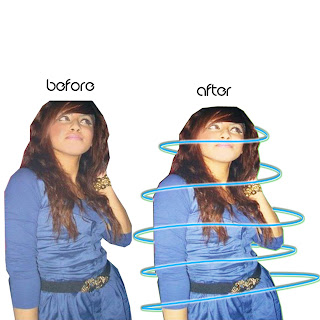
This Picture was the first image that I used on my interview page. I wasn't entirely happy with this picture as it was LQ and I needed an HQ picture in order for me to edit it on photoshop.
I managed to increase the brightness/contrast of the picture and then I used 'surface blur' to cover up any imperfections that was on the picture.
Finally I also added another glow around her to make the image more interesting.
My models pose was chosen to give an sophisticated look.
The mise-en-scene was just a plain,blank wall in which i chose so that it was easier to cut around.
I disliked the picture as it looked 'random' on my interview page and it did not meet my expectations so I therefore changed it.

Before Editing & After Editing Final Contents Page Pictures Test 2

Here I have used the same image for my contents page but I have completely re-edited it.
Instead of me using all the typical Surface Blurs, and all those other airbrushing tools on Photoshop I decided to go for a whole new look and a whole new different way of editing this image.
I made my model into a cartoon as I thought Cartoon images are bright and colourful and that Is what I needed.
I used photoshop to outline my models main features and I then coloured in her face,hair,jacket and scarf with the paint brush tool.
I also drew on a pair of headphones with the pen tool to make the image more music related.
The paint brush tool was also used to colour the background in black, as the colour black is one of my main colours that has been used throughout my entire magazine.
I also used the pen tool to create the glow around her to just give the image another cool effect.
The colour of the glow is purple to match her scarf colour. I changed the colour of her scarf because the original pattern on it was to hard and very time consuming in order to get the replica looking perfect.
I am using this picture as my final image for the contents page as i feel that the image gives me more room to add colourful graphics and design to make it look how I want it to.

Before Editing & After Editing Final Contents Page Pictures Test 1

This image was chosen for my final Contents Page Picture.
I liked the pose of my model and as stated before the mise-en-scene was easy for me to cut around and edit.
Now instead of me brighting the contrast of this image, I decided to desaturate it and add a film grain filter instead.
At the time I thought the image looked good and different as it was a black and white image, but putting the final picture into action and on an A4 page it didn't look right and as i've mentioned i wanted my magazine to be colourful, loud and bright, and by having this saturation image just wasn't doing it for me so I had to re-edit the picture and do something that fitted my criteria.

Tuesday, 13 April 2010

Before Editing & After Editing Final Front Cover Pictures Take 2

After attempting to use my previous picture for the front of the magazine I had a lot of trouble getting it to look good on the page. The angle that the picture was taken in was too close and I wanted more of a mid-shot, so therefore re-took the picture and went with a medium close-up.
I changed the main image to this picture because I liked the position that my model was in. I also used this picture because unlike the first picture her facial expression is more serious. Although my model is semi-smiling she still manages to maintain a neutral expression and i thought that a serious expression is more needed to define her as a 'HipHop' artist rather then having her smiling as 'HipHop' really has nothing to do with happy stuff. It is more about real life issues that people have had to endure and therefore they sing/rap about it
As far as the editing goes I still kept the same techniques. Yet again adding the same brightness/contrast, the same make-up [but i used 'Blue' eyeshadow instead)
Finally this picture suited the page better as it allowed more room for other stuff to be written in the same area.
Overall I liked the outcome of the editing of this picture, So I used it as my last and final main image of my front Cover.

Before Editing & After Editing Final Front Cover Pictures Test 1
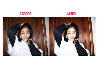
I chose to use this picture as my main front page image. I liked the pose that my model was in and the angel that the picture was taken. I also liked the background behind my model. It was fairly easy to cut around as it is just a simple wooden image and not a random busy background.
I edited this image by adjusting the Brightness/Contrast on Photoshop CS4 to give the picture a more 'Live' and 'Bright' feel as the original image seems pretty dull.
I also gave my model more make up on photoshop, as previously stated before I wanted my picture to be 'Loud' and 'colourful' and the original image made me think differently. Therefore I added some colour to my models lips, briefly airbrushed her face, added some blusher,'Green' eyeshadow and fake eyelashes which were photoshop brushes downloaded off of 'Deviantart.com'
I also gave my model an tattoo on her right hand to give her persona a different edge.

NME Reader Profile

Sunday, 11 April 2010

Test Shots

These are my Test Shots for my Magazine.
The main angle that I used was a medium shot and a Close Up Shot.
There was no particular Mise-en-scene chosen as all I really needed was a simple background which enabled me to cut around and stick onto another background.
I was not really fond of the bottom three pictures as they were low quality and the lighting wasn't that good and the flash on the camera would leave light marks on my model.
So therefore the top four pictures were in my favour as they had all the correct features that I needed in order to create my HipHop magazine.

My Iconography

This is my iconography of the type of style and genre that I wanted to incorporate into my own magazine.
The genre is Hip Hop and the style is bright loud colours, and this is how I want my Magazine to be in terms of colours/style/mise-en-scene.

Defining My Music Genre [HipHop)

Definition of Hip Hop :- "Hip hop music, also referred to as rap or rap music, is a style of popular music which came into existence in the United States during the mid-1970s, and became a large part of modern pop culture during the 1980s. It consists of two main components: rapping (MCing) and DJing (audio mixing and scratching). Along with hip hop dance (notably breakdancing) and urban inspired art, or notably graffiti, these compose the four elements of hip hop, a cultural movement that was initiated by inner-city youth, mostly African Americans in New York City, in the early 1970s"

In my opinion, there is so actual definition to Hip Hop as it can have many meanings to each and every individual.
To me Hip Hop is the love of music, the culture, the passion and the freedom of expression.
Before modern Hip Hop was/is classed as "dead' it was known for it's smooth, soothing beats, intelligent, sincere rhymes and a solid representation of urban lives.

Hip Hop music can range from slow, slurring speech with digital beats and a heavy bassline known as gangster rap, or southern rap, which is mostly responsible for the the so-called "death" of Hip Hop to fast, crisp lyrical delivery with the instrumentals ranging from a multitude of sounds and instruments.

Advertising Simulation [iWannabe)


In Pairs we were given an advertising simulation task. My Partner Sabrina and me were told to create a magazine cover for young people aged seven to twelve or also known as the Proto-Teens. After reading our given description we found out that the genre that our magazine cover had to be based on was pop music.

Now when I first hear the words pop music automatically the typical stereotypes of thousands of young girls screaming for a well known pop artist or pop group comes to my mind.

Now with this my partner and me thought that keeping our target audience in mind we have to do like a more feminine, girly house style, as they are whom we were targeting.

Therefore we used a baby pink background and we used Britney Spears as the main image. We used her because in the description it said that she was an iconic role model to the proto-teens at the time. Now this leads us to the name of the magazine. We chose the name iWannaBe as young children of this age look up to many artists and try to aspire to be like them, whether its the way they start to dress, talk, walk etc.

We also used an image of one of the biggest boy bands of the country [JLS). We thought they would be an ideal artist to place on the cover as they are very well know pop artists and they have a huge fan base ranging from all types of ages. By using them on the cover and stating that there is an exclusive interview of them featured in the magazine, this helps attract more potential buyers, as they are a one of the most successful boy bands in music history. They also have thousands of fans that they seem to leave in some sort of hysteria and we kind of took advantage of this and placed them on the front in hope of it endorsing our magazine and attracting thousands of buyers.

Overall I thoroughly enjoyed this task as it helped me gain many new skills such as Photoshop and it was good practice for planning my final magazine.


Editors Letter

....................

Friday, 9 April 2010

My Final Reader Profile

Here is my Hip Hop magazine Reader Profile.
I drew up a table on a Word Document and then filled out the appropriate statistics that matched my criteria.
I decided to outline my readers age, gender, whether they working working or students and if they attended live concerts/gigs etc.
I also calculated the amount of readers who purchased their music online or from stores and the amount who listened to the radio stations.

Target Audience Research [Questionnaire)

Target Audience Research