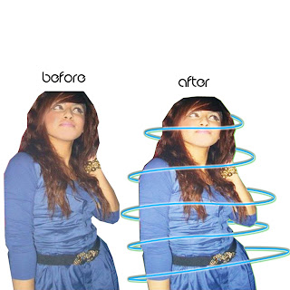
This Picture was the first image that I used on my interview page. I wasn't entirely happy with this picture as it was LQ and I needed an HQ picture in order for me to edit it on photoshop.
I managed to increase the brightness/contrast of the picture and then I used 'surface blur' to cover up any imperfections that was on the picture.
Finally I also added another glow around her to make the image more interesting.
My models pose was chosen to give an sophisticated look.
The mise-en-scene was just a plain,blank wall in which i chose so that it was easier to cut around.
I disliked the picture as it looked 'random' on my interview page and it did not meet my expectations so I therefore changed it.


No comments:
Post a Comment