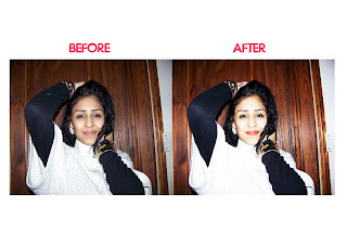
I chose to use this picture as my main front page image. I liked the pose that my model was in and the angel that the picture was taken. I also liked the background behind my model. It was fairly easy to cut around as it is just a simple wooden image and not a random busy background.
I edited this image by adjusting the Brightness/Contrast on Photoshop CS4 to give the picture a more 'Live' and 'Bright' feel as the original image seems pretty dull.
I also gave my model more make up on photoshop, as previously stated before I wanted my picture to be 'Loud' and 'colourful' and the original image made me think differently. Therefore I added some colour to my models lips, briefly airbrushed her face, added some blusher,'Green' eyeshadow and fake eyelashes which were photoshop brushes downloaded off of 'Deviantart.com'
I also gave my model an tattoo on her right hand to give her persona a different edge.


No comments:
Post a Comment